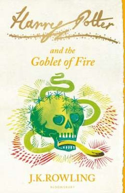
After years of fans imagining their own versions of the Harry Potter covers, the UK publisher of the series has finally come around. Later this year, Bloomsbury Publishing will re-release the series with new minimalist "signature series" designs for the cover. And yes, this time it's for real.
The art for "Half Blood Prince" is particularly good, though it would work better for a copy of Shakespeare's "The Tempest."
Early last year, illustrator
M.S. Corley unleashed an amazing collection of re-imagined covers for the Harry Potter series. The covers were what the Harry Potter series might have looked like if they had been released 50 years ago. They were a brilliant example of two-color design, and in general, they're an excellent example of graphic composition. They're a major improvement on the overwrought designs that are the current face of the series.
In April,
Michela Monterosso created another set of
covers for the Harry Potter series, this one even more minimalistic than the last. I don't think they have quite the same impact, though.
Also, don't miss Cracked's gallery of "
Harry Potter Book Disguises."


No comments:
Post a Comment